
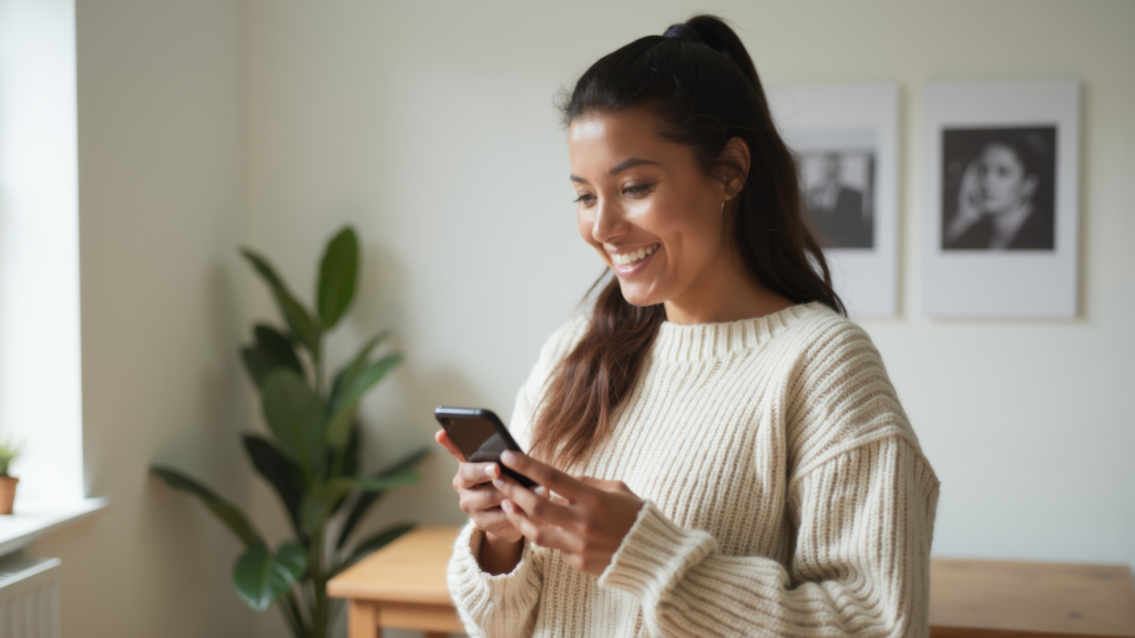
If your phone feels friendlier lately, you’re not imagining it. Over the past few years, the harsh edges, loud colors, and jumpy animations that once defined tech design have quietly melted into something gentler. Interfaces look pillowy. Colors feel calmer. Even the way apps open seems less abrupt. It’s all part of a broader shift toward “soft design,” a movement guided by psychology as much as aesthetics. Designers know we’re overwhelmed — by notifications, by stress, by modern life — so they’re shaping our screens to help us breathe a little easier. Your phone isn’t just smarter now. It’s softer on purpose.
Rounded Shapes Everywhere

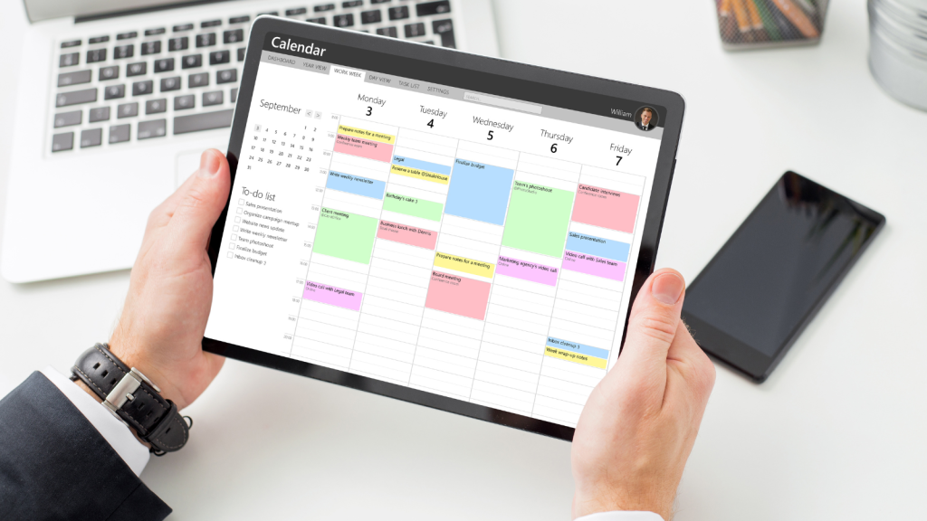
Sharp edges feel threatening to the brain — a leftover instinct from scanning for claws and thorns. Designers know this, and research backs it up: rounded shapes are perceived as friendlier and more welcoming. So the corners of your apps, cards, and buttons have softened. The emotional effect is subtle but real. When everything on your screen looks less aggressive, your body relaxes a little. It’s design as micro-comfort.
Muted Colors That Lower the Volume
Bright primaries once ruled tech because they “popped,” but they also shouted. Muted palettes — sage greens, dusty blues, soft lavenders — create a quieter emotional experience. Designers now choose colors the way interior decorators do: to reduce stress. Studies show calmer palettes help with focus and lower perceived mental load. Your screen isn’t just nicer to look at. It’s easier to be around.
Smoother, Slower Animations
Early smartphone animations snapped and bounced like energized rubber bands. Today, transitions are softer, easing in and out rather than jumping. Motion designers learned that abrupt movement creates micro-jolts of stress. Even a tiny pop-up can spike alertness. Softer motion feels more natural — like turning a page instead of flipping a switch. Your phone is trying not to startle you.
Space to Breathe
Whitespace is a design form of fresh air. Crowded layouts force the brain to scan and sort too quickly. That’s tiring. By giving elements more room, apps reduce cognitive load and help you process information calmly. The design may look simple, but it’s doing emotional labor behind the scenes.
Notifications That Don’t Bark
Gone are the bright red badges and bold, buzzing banners. Many apps now use softer hues and less intrusive animations for alerts. It aligns with “calm design” — the principle that tech should respect your attention, not hijack it. A softer alert still informs you, but it doesn’t feel like someone tapping your shoulder repeatedly.
Hardware Following the Same Trend
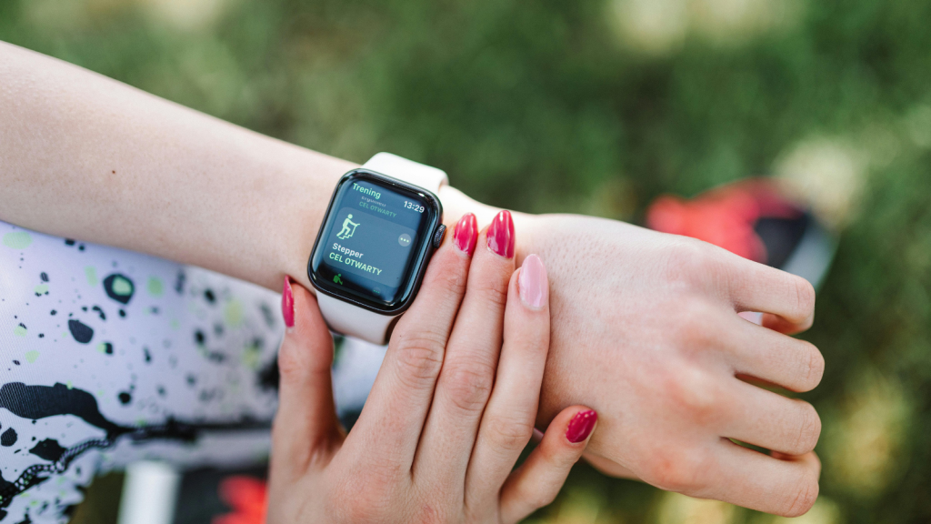
It’s not just the software. Devices themselves have softened. From rounded phone bezels to smooth smart home speakers, hardware now feels less like machinery and more like something meant to live comfortably in your space. Physical softness supports digital softness, creating a feeling of approachability.
Designers Responding to Tech Fatigue

People are burned out from endless alerts, multitasking, and digital noise. Designers aren’t ignoring that. Soft design is partly a response to user fatigue: a way to reduce tension rather than amplify it. A calmer screen doesn’t fix burnout, but it avoids adding to it. It’s small compassion embedded in pixels.
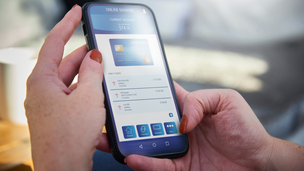
Soft Design Makes Apps Feel More Trustworthy
Research shows that friendly shapes and balanced palettes can increase trust. It’s not manipulative — it’s emotional environment-building. When an app looks less harsh, you naturally relax and feel more open to interacting with it. It’s especially common in banking, healthcare, and wellbeing apps, where comfort matters.
Why Soft Equals “Easier to Use”

There’s a psychological phenomenon called the aesthetic–usability effect: people believe attractive things work better. Soft design taps into that by making interfaces feel pleasant and easygoing. And because you expect them to be easier, you interact with less stress — which often makes them genuinely easier to use. Comfort becomes competence.
Your Screen, But Kinder
The shift toward softness isn’t just a trend. It’s part of a growing recognition that tech shapes our emotional temperature. When your screen greets you with gentler visuals, your brain responds with steadier energy. Softer design doesn’t solve everything, but it reduces one small source of friction in everyday life — and that adds up.